For starters: I sometimes like to design flags and coats of arms for fun.
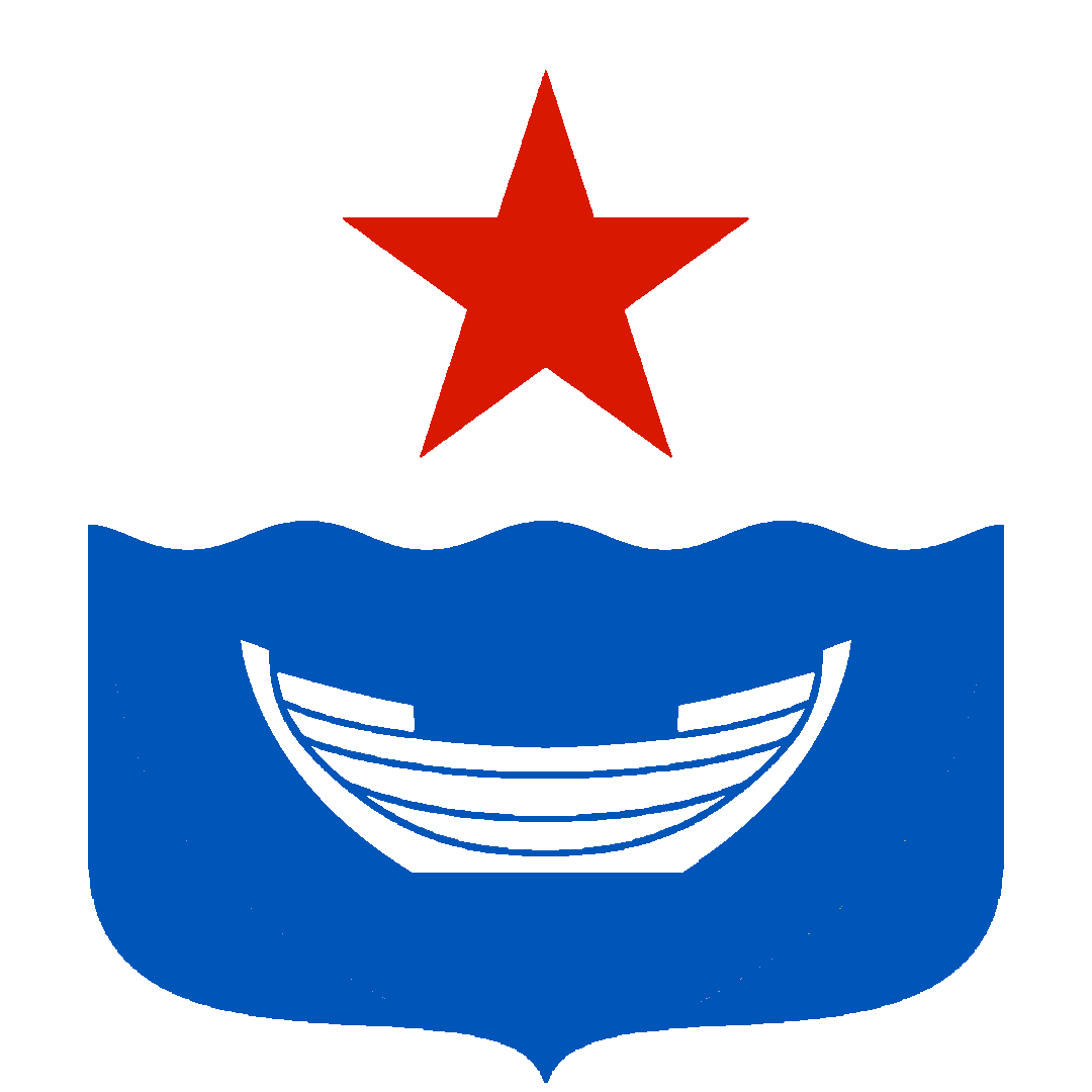
My latest one is the coat of arms of the fictional Porkkala Raion of the Leningrad Oblast.

For context: the Porkkala peninsula in Finland was leased to the Soviet Union at the end of the Continuation War in 1944 for 50 years, where the Red Navy set up a naval base. In real life the area was returned to Finland in 1956, but I wanted to imagine an alternate world where the handover didn’t happen.
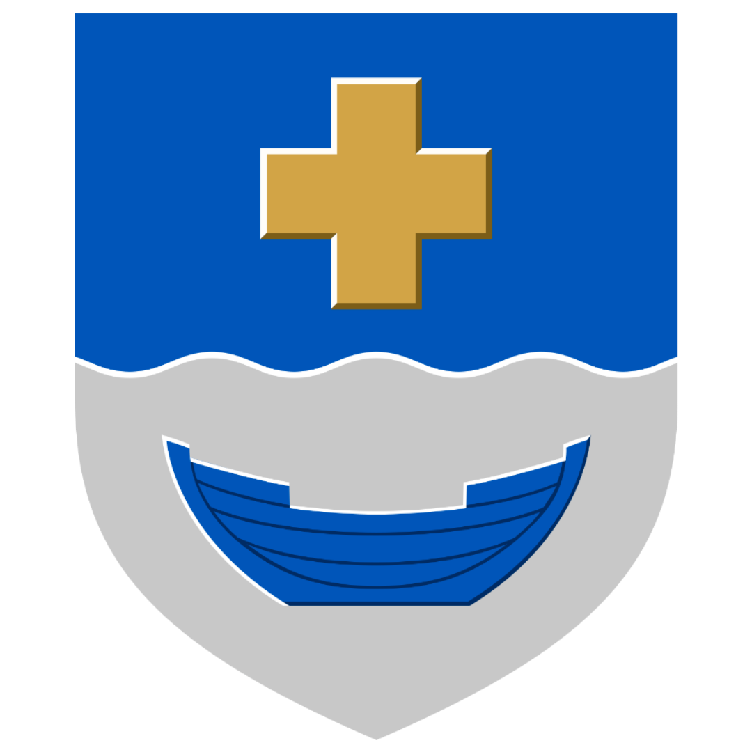
The real world coat of arms of Kirkkonummi municipality, where the Porkkala peninsula is, was adopted in 1956. The symbolism is very simple: Blue and white, and the wavy line symbolizes the sea. The cross symbolizes the St. Michael’s Church in Kirkkonummi. And the boat symbolizes the region’s boating traditions.

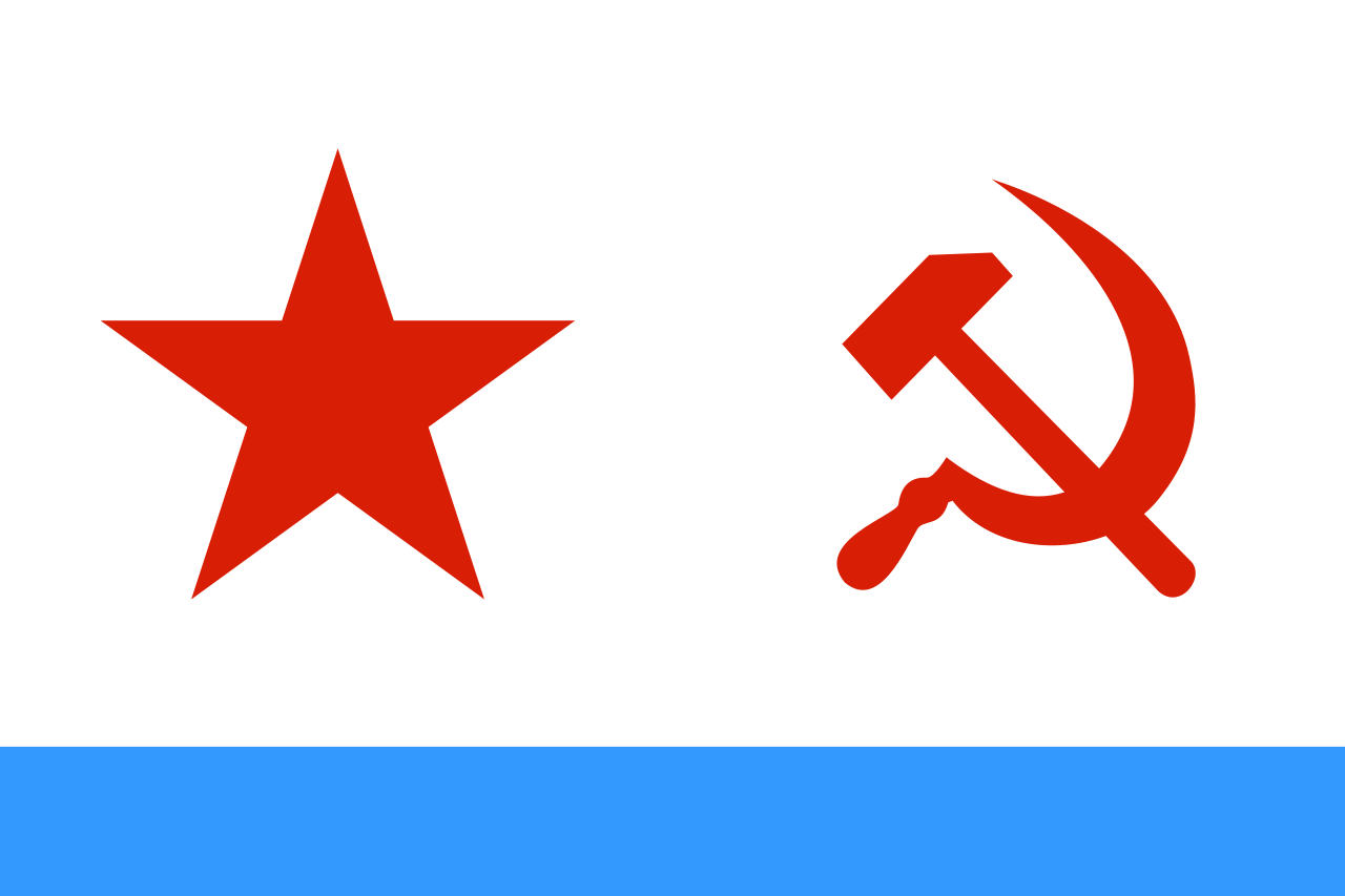
Now for the alternate world’s coat of arms, I essentially mixed the real world naval ensign of the Soviet Union with the coat of arms of Kirkkonummi. The red star and the inverted colors obviously reference the Red Navy ensign. I kept the boat because of the maritime element, but also because a simple fishing boat can serve as a reference to the peasantry, which I imagine is something Soviet heraldists would be into. I also changed the shape of the shield to be more in line with Russian heraldic tradition.

This was just a rambling example of what heraldry/vexillology can be like if you’re very into it.
I like doing stuff like this because it combines graphic design, symbolism, history and creative writing.